Bodyport Cardiac Scale
A Smart & Simple Way To Track Your Heart Health
Sophic Design partnered with Bodyport to develop an intelligent scale that uses sensors and connected technology to monitor both body weight and cardiovascular health
Lifesaving Connected Technology
What would it take to trust a scale with your life? Bodyport is a biomarker-guided digital therapeutics company that integrates a sophisticated and innovative biomarker platform into simple, easy-to-use devices to address complex chronic cardiac conditions. With one simple step on the scale, users can access comprehensive health insights in their own home. Now patients and care teams can better understand, predict, and intervene in situations of worsening health to prevent hospitalizations and improve quality of life.
The Bodyport platform is the first, and only, fully integrated solution designed to simplify and improve heart disease management by way of a novel, noninvasive biomarker platform built into a simple and easy-to-use scale. But it’s so much more than that.
Bodyport for Heart Health integrates a robust clinical dashboard and personalized patient experience, giving both patients and their care teams comprehensive, actionable health insights—when and where they’re needed.
Design Strategy & Interaction
Bodyport tasked Sophic Design with creating a scale that reflected the intelligence, care, and expertise of their platform while also inviting user interaction. We started by analyzing similar smart scales and personal medical devices on the market to identify visual cues to avoid as well as strategic opportunities around differentiating features, materials, and form languages that could be applied to Bodyport’s existing internal architecture.
Bodyport’s initial internal architecture with basic placement of heal sensors, PCB, AA batteries, and display
Features to avoid: framed LCD displays that are clearly visible when the device is not in use and graphically prominent buttons that require physical actuation
ergonomics & usability Iterations
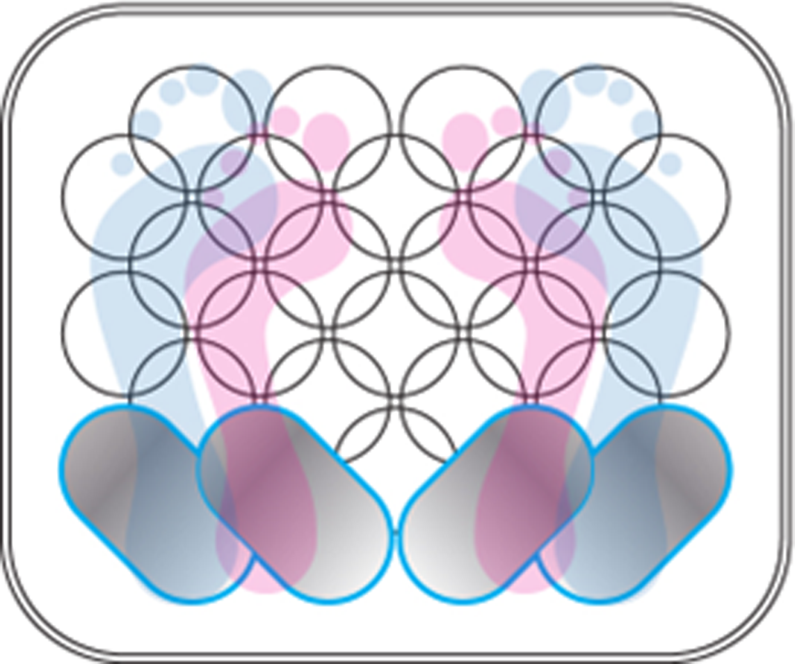
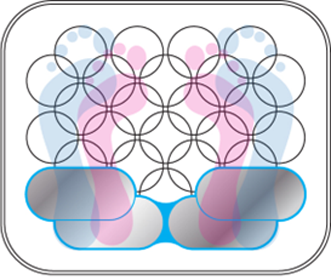
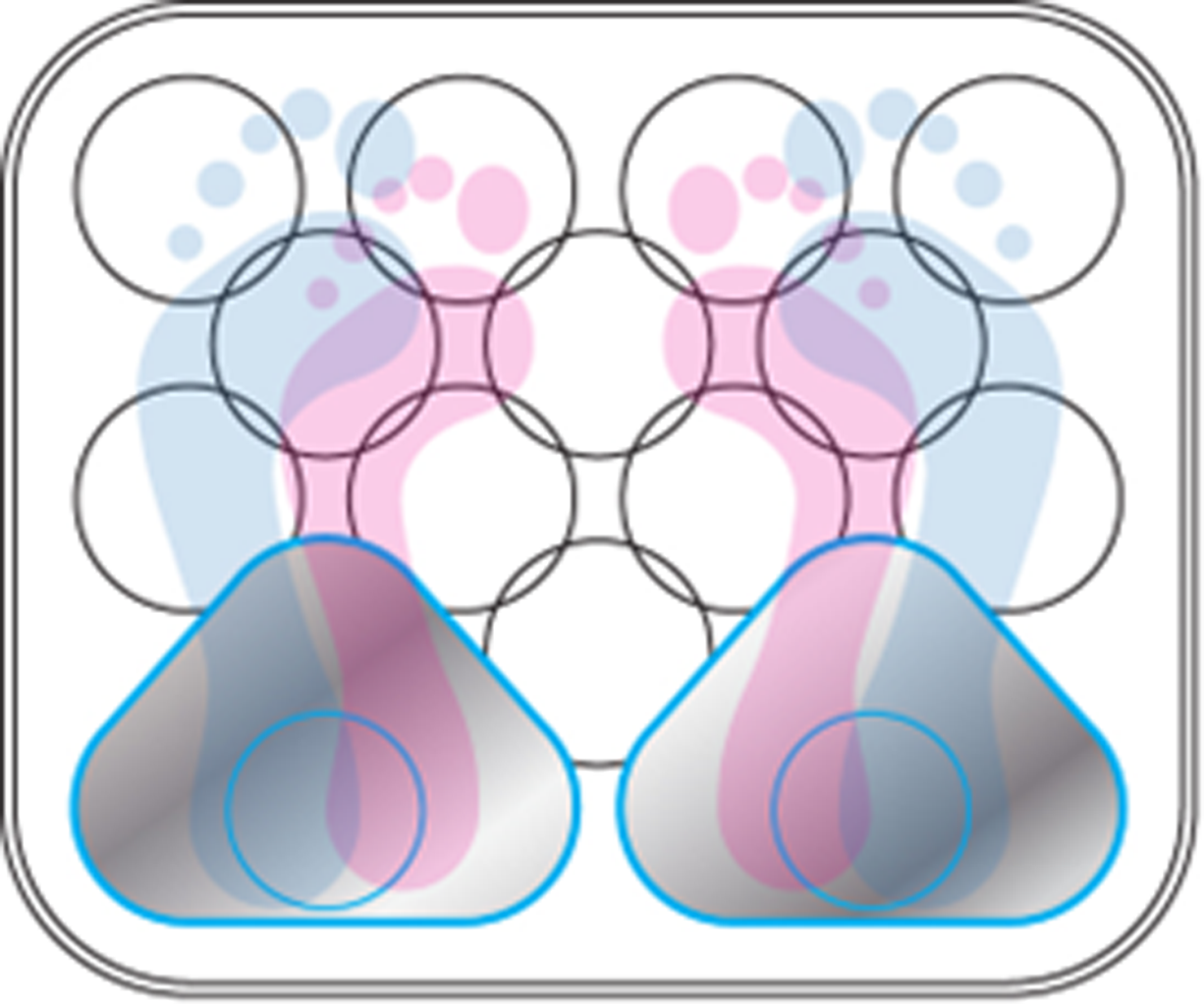
Usability and ergonomic studies were performed early in the development process to properly understand the best configuration for the product’s internal architecture. The placement of the heel sensors that contact the user and relay biometric data were especially important usability components that required in-depth analysis.
Initial studies showing average foot size for men and women superimposed on the basic shape and size of the Bodyport scale. The approximate size and shape of the sensor was revealed by these foot sizes.
Exploration illustrating potential sensor sizes and shapes that occupy the on-product real estate required for proper function and usability.
Initial exploration of sensor component integration with on-product graphics and textures
User Interface Display
Sophic then identified interaction cues that could help inform the display and interface strategy communicating to the user the information that is most important in the simplest, easiest, and most sophisticated way. Dot-matrix displays were identified as a way to create an elegant dead-front display that would disappear when not in use while also providing large and easy-to-read characters that can be seen in dark and moderate lighting. The dot matrix was also identified as an important metaphor that illustrates how the Bodyport scale synthesizes large amounts of complex data and relays them back to the user in terms that are intuitive and easy to understand.
Examples of simple dead-front LED displays that use a combination of shapes, colors, and characters to communicate messages and progress
inspiration & concept development
When designing device that communicates data about your heart’s health the quality of trustworthiness is critical to success. If users do not believe that the information being relayed to them is accurate then the product and the platform are fundamentally flawed. In communicating “trustworthiness” the device needed to be imbued with a sense of precision, quality, and life that would make the product simultaneously intelligent, friendly, and powerful. Because these qualities are often at odds with one another Sophic needed to create a design language that turned dissonance and conflict into harmony and beauty.
The resulting aesthetic would mix competing visual elements such as sharp vs soft surface transitions, matte vs glossy finishes, and structured vs organic detailing in a way that would be compelling, intuitive, and inviting.
Initial concept development and exploration leveraging visual cues from the above inspiration images
Touch, Texture, & Interaction
Because users would have direct physical contact with the device while in use, a variety of textures and graphics were explored as an opportunity to invite interaction and physical touch while reinforcing brand perceptions of precision, intelligence, and trustworthiness.
Reconciling competing and dissonant qualities between technology and humanity again became a priority in identifying appropriate graphic elements to compliment the form. Motion, growth, and transformation were identified as appropriate metaphors that could simultaneously speak to the elements of wirelessly communicated data as well as life and health that are inherent to the core functionality of the product itself.
Bodyport scale concepts exploring various graphic applications that are applied on both the top of the scale and molded beneath the clear back-painted top surface that users stand on.
Final Design & Detailing
The final result is a device that is simple and soft to invite interaction, yet crisp and precise enough to reflect the reliability of the technology contained within, and of high enough quality that it can be trusted with your life.
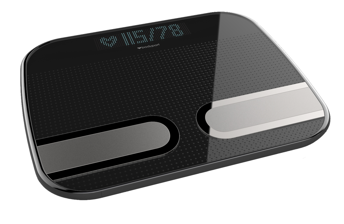
Top surface of the Bodyport Cardiac Scale boasts a bright dead-front dot-matrix LED display, racetrack-shaped sensor contacts that emphasize dynamic motion and clean sophistication, and back-molded textures that reinforce the simplicity and elegance of the UI.
Blending side, front, and back surfaces create a dynamic design that feels both soft and inviting as well as crisp and clean.
Integrated feet blend into the scale’s bottom housing creating soft, cleanable surfaces.
Color, Material, & Finishes
When considering additional product SKUs that could take on new and unique colors, materials, and finishes, Sophic returned to the original sources of inspiration that helped drive the product’s form development, textures, and graphics so as to maintain the integrity and consistency of the Bodyport design language .


